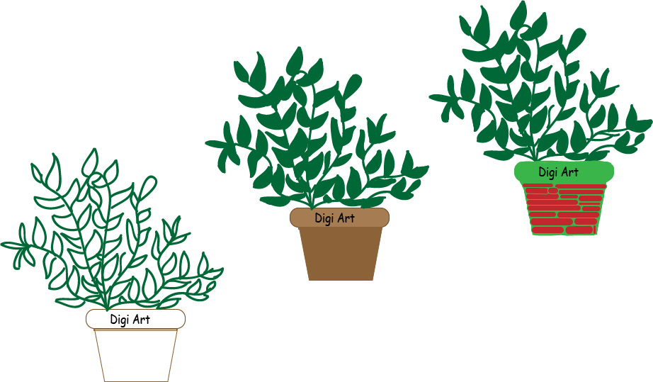
For this project, I utilized different shape tools, the different sizes of the paintbrush tool, played around with texts and learned how to layer within illustrator.
I kept the first one simple to see if I liked the design that I created in its simplest form.
The second one has very stereotypical colors for a plant and it’s pot. Although it isn’t super exciting looking, I like the way that it turned out.
Lastly, for the final image I wanted the pot to look somewhat like stacked bricks. It had white space which I filled in with a fun green color. This was done by adding a layer within that image so that I could color and not interfere with the colors or lines of the red shapes. When filling in the leaves, I increased the size of the paintbrush tools so that when I went to go color them in it would be a speedier process.
Latest Posts
Robert Beatty
Robert Beatty is an artist and musician based out of Kentucky who uses a combination of Adobe Photoshop and Illustrator to make super cool, psychedelic artwork for album covers. Within these programs, he uses numerous layers to enhance detail, frequently uses the masking tool and digital airburshing has become one of his signature looks. In an article posted in AIGA’s eye on the design it mentions how Beatty did not take the traditional route of going to art school but rather taught himself many of the techniques that he now uses. His work takes on a futuristic, psychedelic form that sets him apart from so many other current artists. Much of his inspiration came from artists that were popular in the 60s and 70s such as Masakazu Kitayama, Milton Glaser and more.
Initially I was surprised by the diversity of musicians that sought him out to produce their album artwork. After spending some time with it, it made sense because his work is so broad that it isn’t limited to one specific genre of music. I really liked the vibrant colors that are used along with hypnotic backgrounds because it was nothing like what I’m used to seeing.
My favorite pieces are shown below:
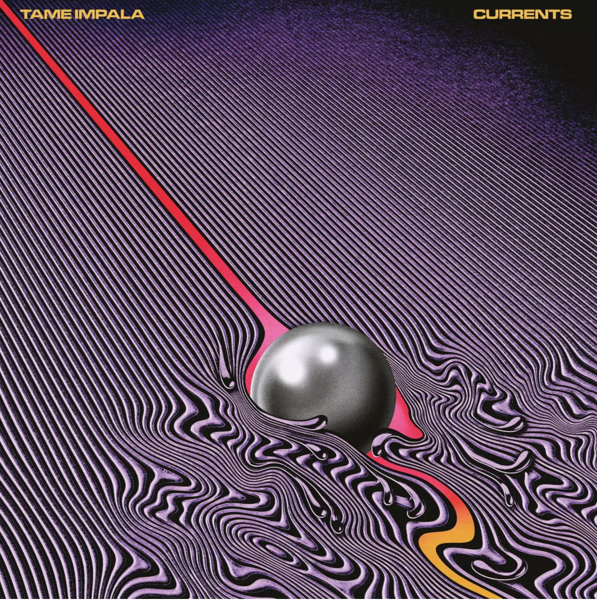
I loved the movement that is depicted in this cover. I’m torn between deciding if the ball is working it way uphill and that’s why the lower half is more chaotic or if it was rolling downhill. It’s very open to interpretation and that’s some of the beauty behind it.
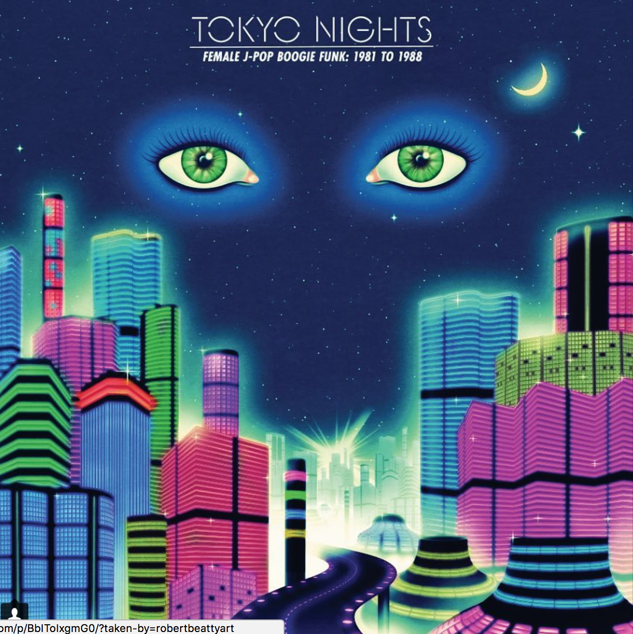
This cover stood out to me because it reminded me of futuristic version of F. Scott Fitzgerald’s Great Gatsby cover.

I thought this one was exceptionally cool because it changes each time you look at it depending on what your eye focuses on. The darker, black spot at the tree could also serve as the star, or tree topper which is incorporated in a fun, subtle way.
Sites visited:
http://www.robertbeattyart.com/About
https://www.villagevoice.com/2017/05/25/let-it-happen/
https://pitchfork.com/tv/50-pitchfork-unsung/1562-pitchfork-presents-unsung-robert-beatty/
https://www.washingtonpost.com/entertainment/music/all-of-the-best-new-psychedelic-album-covers-are-made-by-the-same-guy/2017/01/19/fa489522-d76d-11e6-9a36-1d296534b31e_story.html?utm_term=.c6f368d710cb
https://www.rollingstone.com/culture/lists/the-hot-list-2017-people-and-trends-were-talking-about-w510732/hot-album-artist-robert-beatty-w510856
https://www.instagram.com/robertbeattyart/
Blog Post 1
How do you define digital art?
Digital Art is anything that takes place through some means of media such as photography, photoshop, illustrator, 3D printing, videos, etc.
What are the defining features, advantages, and limitations that make digital art unique from other forms of visual expression?
Digital Art is unique from other forms in that it can be created using so many different platforms and is more open ended because of that. However some limitations might be that unlike other, more traditional forms of art, texture isn’t as prevalent in pieces because its all 2D.
Provide 3 examples (images, videos or gifs) of digital art that speak to your personal aesthetic and briefly describe why you chose it. At least one of these examples should be a piece that you discovered through researching this blog post.
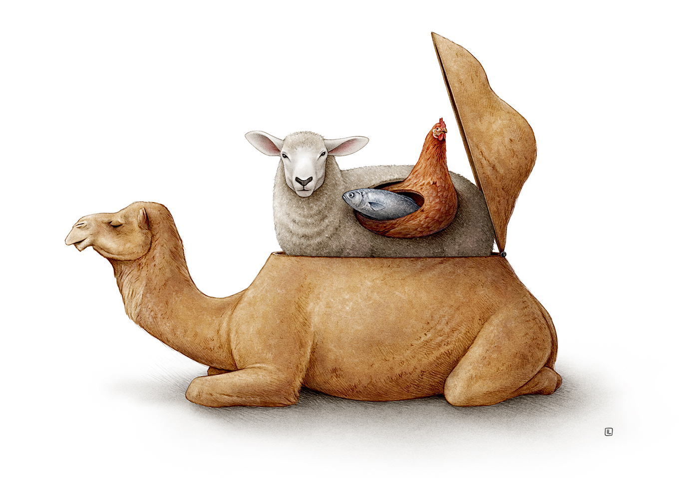
This piece was done by Irene Laschi and it really stuck out to me while I was looking at all of the different options on Behance’s site. Initially, I was expecting it to be similar to Russian Nesting Dolls where each piece is a smaller version of the origInal large one. I really liked how she incorporated each of the different animals into the image.

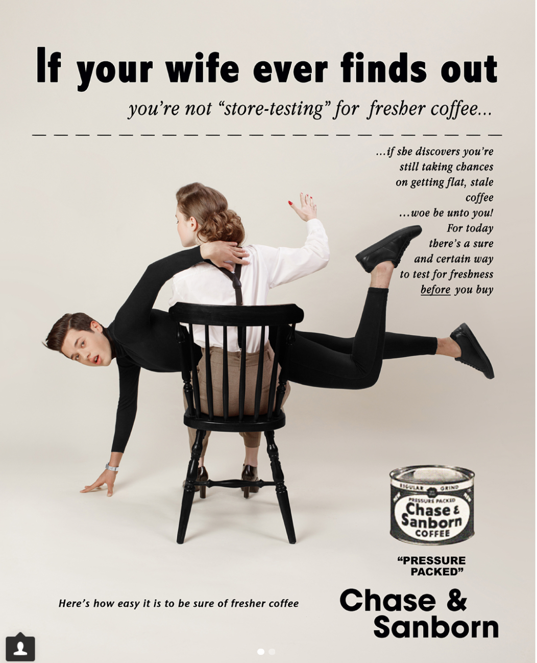
I absolutely loved what Eli Rezkallah did in her latest series. So much progress has been made in the past few decades that it’s amazing to see how gender roles used to be portrayed in advertisements. The changes that she made we so subtle yet so profound. I loved how she kept the color scheme, font, and text the same with the exception of changing the roles of the male and females and how their pronouns were used in a sentence.
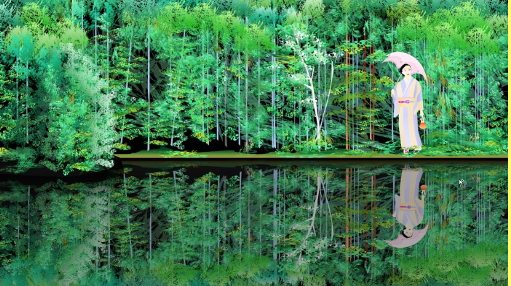
This piece was done by 77 year old, Japanese artist Tatsuo Horiuchi. All of his work is done using Mircrosoft Excel programs and utilizing its tools such as the line tool and bucket tool. After taking several chemistry classes here, I became very accustomed to Excel but would never have thought that anything like this was possible. I love the simplicity of the concept and how intricate the final product is.