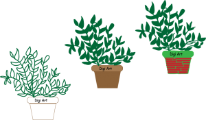
For this project, I utilized different shape tools, the different sizes of the paintbrush tool, played around with texts and learned how to layer within illustrator.
I kept the first one simple to see if I liked the design that I created in its simplest form.
The second one has very stereotypical colors for a plant and it’s pot. Although it isn’t super exciting looking, I like the way that it turned out.
Lastly, for the final image I wanted the pot to look somewhat like stacked bricks. It had white space which I filled in with a fun green color. This was done by adding a layer within that image so that I could color and not interfere with the colors or lines of the red shapes. When filling in the leaves, I increased the size of the paintbrush tools so that when I went to go color them in it would be a speedier process.